We’ve now seen three examples of this: one from corporate America, one from the cultural sector, and one from roadside America. Each tried to tell a grand story through a small visual gesture—and discovered that audiences no longer buy theater without proof of substance.
Case Study 0: GM and the “Electric Destiny” Logo
Back in 2021, General Motors rolled out a new lowercase logo—g and m in soft blue, the “m” gently underlined, meant to symbolize the horizon of an all-electric future. The story around it was cinematic and prophetic: GM was reinventing itself for a new era of mobility.

The design itself was simple enough, but the storytelling around it was enormous— high-production videos, glossy animation, a manifesto tone that tried to make “General Motors” sound more like a tech startup than a century-old automaker.
At the time, the reaction was mild. Nobody rioted in the comments, but nobody was moved either. In hindsight, it might have marked the end of an era—the last major rebrand where a company could still narrate its own destiny through a symbol.
If GM attempted that today, they’d almost certainly do it differently. They’d skip the grand theater, skip the human-destiny narration, and focus on proof. They’d roll out the Ultium platform, prove their charging infrastructure, and quietly refresh the mark once people already believed the story.
That’s the lesson here: humility before humiliation. Don’t declare the future; demonstrate it. Then codify it with design.
Case Study 1: Cracker Barrel’s Glow-Up That Became a Blow-Up
In August 2025, Cracker Barrel unveiled a simplified mark that dropped its beloved “Uncle Herschel” and barrel, leaving a flattened yellow badge with the name inside. The rollout was grand: morning-show segments, press, national attention. It was framed as part of a modernization effort.
The problem? They treated a minor shape update like a moon landing. Within days, the Internet tore it apart. (There's no way to overstate this. It was BRUTAL.) What was intended as a cheerful modernization quickly turned into a social-media bonfire. Culture-war framing entered the chat, and within a week, Cracker Barrel reversed course. It was a brutal, brutal week at CB HQ.
The irony is that the original intent was practical: improve highway billboard legibility. That’s a good reason to update a logo—but it was revealed after the backlash, when no one was listening.
If Cracker Barrel had led with humility—“We need better readability on billboards; here’s the before-and-after”—it might have been a non-event. Instead, the debut was an event, and the logo became a lightning rod.

LESSON: The reveal format is part of the design. When you put a color block on national television and call it "news," you invite scrutiny that no shape can survive.
Case Study 2: The Philadelphia Museum of Art → The Philadelphia Art Museum
This story, something I stumbled upon earlier this week. It seems like a farce, but it’s real. The Philadelphia Museum of Art decided to rebrand itself as the Philadelphia Art Museum—a minor name swap that somehow felt like an identity crisis.
The new circular griffin badge is a throwback of the 1938 logo of the museum. But in the current era, the revised logo / badge looks more like a sticker for a punk band, not a “premier cultural institution.” And why does the typography make me think of take-out food? Or fortune cookies?
The rationale for all of this, reportedly, was to reach younger audiences. But no one could explain how a logo alone would accomplish that. Within days, the Internet did what it does best—mocked it mercilessly. Local media ran headlines about the new “PhAM” (a nickname instantly memed to “PhArt”).

I am not sure how many people saw the full visual identity that design firm Gretel created. Or maybe they did, and decided that 14 fonts was too much. Maybe this will all blow over.
Soon after, the museum’s director was dismissed amid the rebrand turmoil. Are they gonna go back to be the distinguished Philadelphia Art Museum? Will they ditch the logo? We’ll see.
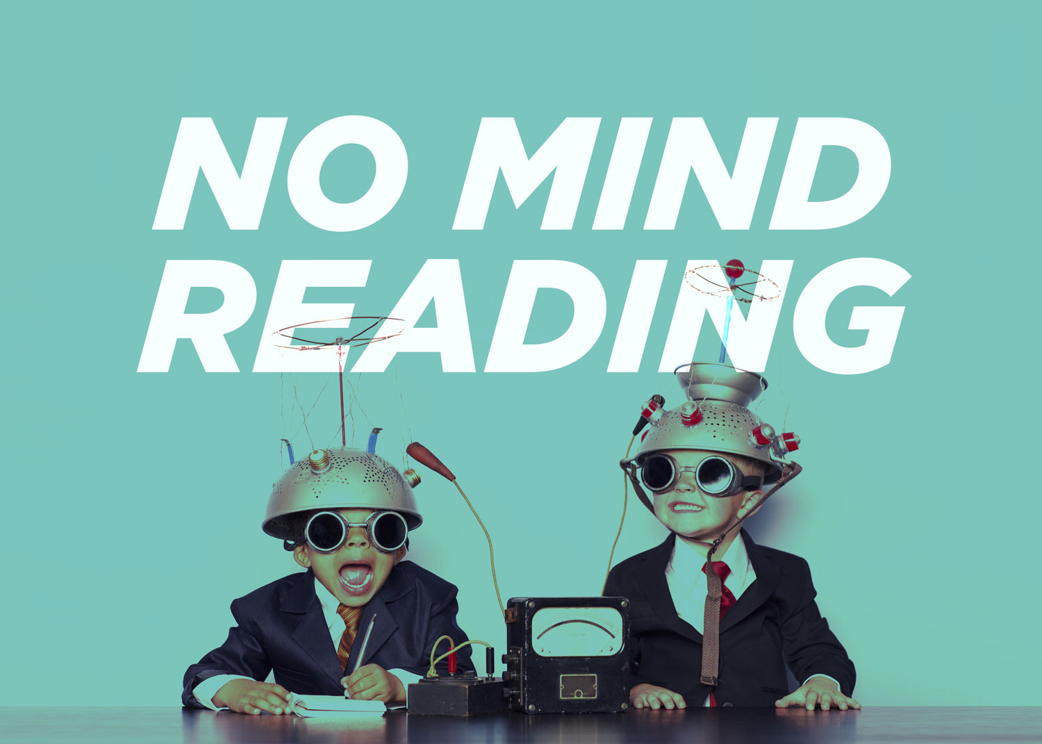
But what’s fascinating isn’t the mockery—it’s the apparent disconnect between intention and perception. Some people inside that boardroom believed this would feel legit and inviting, certainly the CEO and lackies thought this was the right move. Yet to the public, it fell short.
LESSON: Don't overestimate your rebrand, even it if is a small part of a larger comms plan. A younger audience may not care about your logo as much as they care about what’s inside your museum. Which, in recent decades, fails to impress. Ironically, much of modern art is about the narrative / politics surrounding art, not the merit of undeniable talent. Seems to me that the same strategy has failed the art world twice. (Also, I wrote a blog on how to fix this: If You Love Art, You Should Hate the Art World.)
The Shift in the Playbook
For decades, the rebrand ritual followed the same liturgy: the grand reveal, the manifesto video, the press release quoting the CMO on “bold new chapters.” The more expensive the rollout, the more sincere it seemed.
But 2025 is not 2015. The audience is now the critic, the chorus, and the headline writer. The once-passive consumer is now the co-author of brand narrative.
A modern rebrand can still be bold—but it must also be humble, sequential, and earned. You build the proof first, and the logo last.
That’s the thread connecting GM, Cracker Barrel, and the Philadelphia Art Museum. GM’s electric-era logo at least gestured toward a tangible vision, but it still relied on storytelling theater. Cracker Barrel and the museum went further, treating design like destiny—and discovered that when everyone has a microphone, their performance can turn to parody fast.
The wiser strategy—the one GM would likely follow if they did it today—is to do the opposite:
- Lead with the product, not the proclamation.
- Let the new experience precede the new symbol.
- Earn affection through reality, not rhetoric.
Because in the age of instant feedback, a little humility before launch might be the only way to avoid a very public humiliation. Just ask Jaguar. They did something fancy earlier this year, and it seems to have killed the company.
The Questions Worth Asking
These aren’t just cautionary tales—they’re prompts for anyone considering a rebrand:
- What must change in the experience before we change the identity?
If your product, service, or environment doesn’t evolve first, the logo becomes a placeholder for promises you haven’t kept yet. - Are we solving a real usability problem—or chasing “cool”?
Cracker Barrel’s billboard rationale was a legitimate design need. Lead with that story, not the sizzle. Or don’t talk about it at all. The new, tidier interiors? I think people would've loved them, told their friends, and brought them in next time. We’ll never know. - Have we tested the nicknames and memes as rigorously as the lockups?
If your new acronym can be memed with one vowel change, it will be. Throw it at AI and see if the bots can make fun of you. Because if they can, they will! - Are we unveiling the story or the shape?
If your entire rebrand can be summarized as “We changed the logo,” just don’t talk about it. Keep it low-key. - What’s our first-week turbulence plan?
In the comment-driven era, you need a communication plan that responds with clarity, not defensiveness. This requires honesty and vulnerability, something that big agencies hired by big corps often lack. - Which stakeholders get real veto power—and how will dissent surface early?
Because “everyone loves it” usually means “no one felt safe to tell the truth.” I’ve heard that some from the Philly art board were unhappy through it all. Could they have halted this sooner? Me? I prefer to get the negativity and skepticism out early. “Tell me all the reasons why this will fail.”
The Bigger Picture
The old world of branding was built on control. The new world is built on participation. And participation, by nature, is messy.
But that’s not a bad thing—it’s a reality check. The sooner companies accept that, the less painful their next rebrand will be. Because the playbook that once promised grandeur now demands humility. And in the long run, humility is far more powerful than theater.
PS - If Cracker Barrel had started with changing the recipe for biscuits instead of branding, they might’ve ended up with their own version of “Coca-Cola Classic.” Check the story of rejection and redemption over on Wikipedia: New Coke
01/27/2026 - Since this blog was published, Honda seems to have nailed their rebrand with our recommended strategy. The huge company made a super low-key announcement. Perhaps the most low-key line in the whole press release: "New H mark that represents Honda automobile business."