1. The Era & Energy
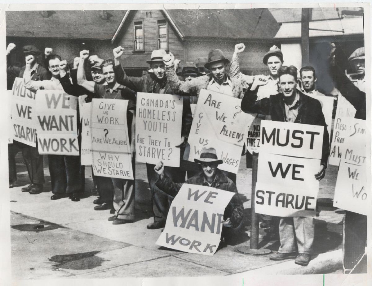
Late 1970s. South Bronx. The city was in crisis—fires, poverty, abandonment—but something new was emerging.
In basements, rec rooms, and basketball courts, kids with no formal music training were inventing DJ culture. And to promote the parties, they made flyers. Dozens of them. Hand-drawn, Xeroxed, and wheat-pasted around neighborhoods that no one else was marketing to.
The energy? DIY + high-stakes + pure hype. Every flyer was a chance to prove this thing—this sound, this culture—was real.

2. The Problem They Were Solving
How do we get people to show up?
That was the central challenge. These parties weren’t on Ticketmaster. The artists weren’t on the radio. Most of the city (and the media) didn’t even know hip-hop existed yet.
The designers—often the DJs themselves—had to:
- Build buzz without a marketing budget
- Convey energy without motion
- Get a crowd with no algorithm
In a way, they were solving the same problem today’s designers face: "How do I make someone care?” Only they had way fewer tools.
3. The Tools & Tech That Made It Possible
The real hero here: The Xerox machine.

For the first time, young artists could copy hand-drawn work at scale. No offset printing, no typesetting—just Sharpies, scissors, Letraset rub-down lettering, stencils, and a public library copier.
What made this “look” possible:
- Monochrome reproduction = heavy contrast
- Cheap paper = texture, grit, smudging
- Layering = cut-and-paste collage feel
This wasn’t low-budget because it was trendy—it was low-budget because that’s what they had. And that limitation became the style.
4. Where They Took Inspiration
The visual DNA of hip-hop flyers pulled from:
- Disco & funk posters (glamour, spotlight energy)
- Pro wrestling ads (stacked names, dramatic type)
- Comics & cartoons (exaggeration, movement)
- Street signage (direct, no-frills communication)
But the real innovation was the remix.
Just like hip-hop sampled beats, these flyers sampled visual culture—then chopped it up and made it their own.

5. The Design System (aesthetics + rules)
Despite the chaos, there was a logic to it.
Core characteristics:
- Black-and-white, max contrast
- All-caps, blocky fonts—hand-drawn or stenciled
- Name hierarchy—the DJ or MC always had the biggest type
- Busy layouts—tons of text crammed in (location, date, lineup, shoutouts)
- Icons & textures—turntables, stars, arrows, lightning bolts
- Diagonal text boxes and layered shapes = rhythm + movement
The aesthetic wasn’t clean—it was kinetic.

6. Where We See It Now
Today’s designers are rediscovering this system—intuitively or deliberately.
Modern echoes:
- Music event posters with Xerox textures
- Instagram carousels mimicking hand-cut collage layouts
- Brands like Awake NY, Brain Dead, and KidSuper using gritty, analog design to stand out in a digital world
- Zine-style art direction in fashion and underground culture
Type designers making fonts that imitate rub-on lettering and 80s stencil fonts
The lesson: If your design feels too polished to move, it probably won’t.
7. What Designers Can Steal
- Urgency beats elegance. These flyers moved people—that’s the goal.
- Design with a reason to exist. These weren’t vanity pieces. They had to fill a room.
- Low fidelity = high energy. Embrace imperfection. Let it scream.
- Make hierarchy visceral. The headliner wasn’t just first—it was giant.
- Own your limitations. The constraint is the aesthetic.
8. A Final Note
Every so often, a creative movement is born out of pure necessity. No funding. No approval. Just the need to say: We’re here. Show up.
That’s what these flyers were. And that’s why they still matter.